ExcelPivotTablesCalculated FieldsDashboard DesignData Analysis
Overview
Investigated churn behavior for a fictitious telecom company to understand not just the overall churn rate, but why customers leave — and which segments are most at risk.
What I did
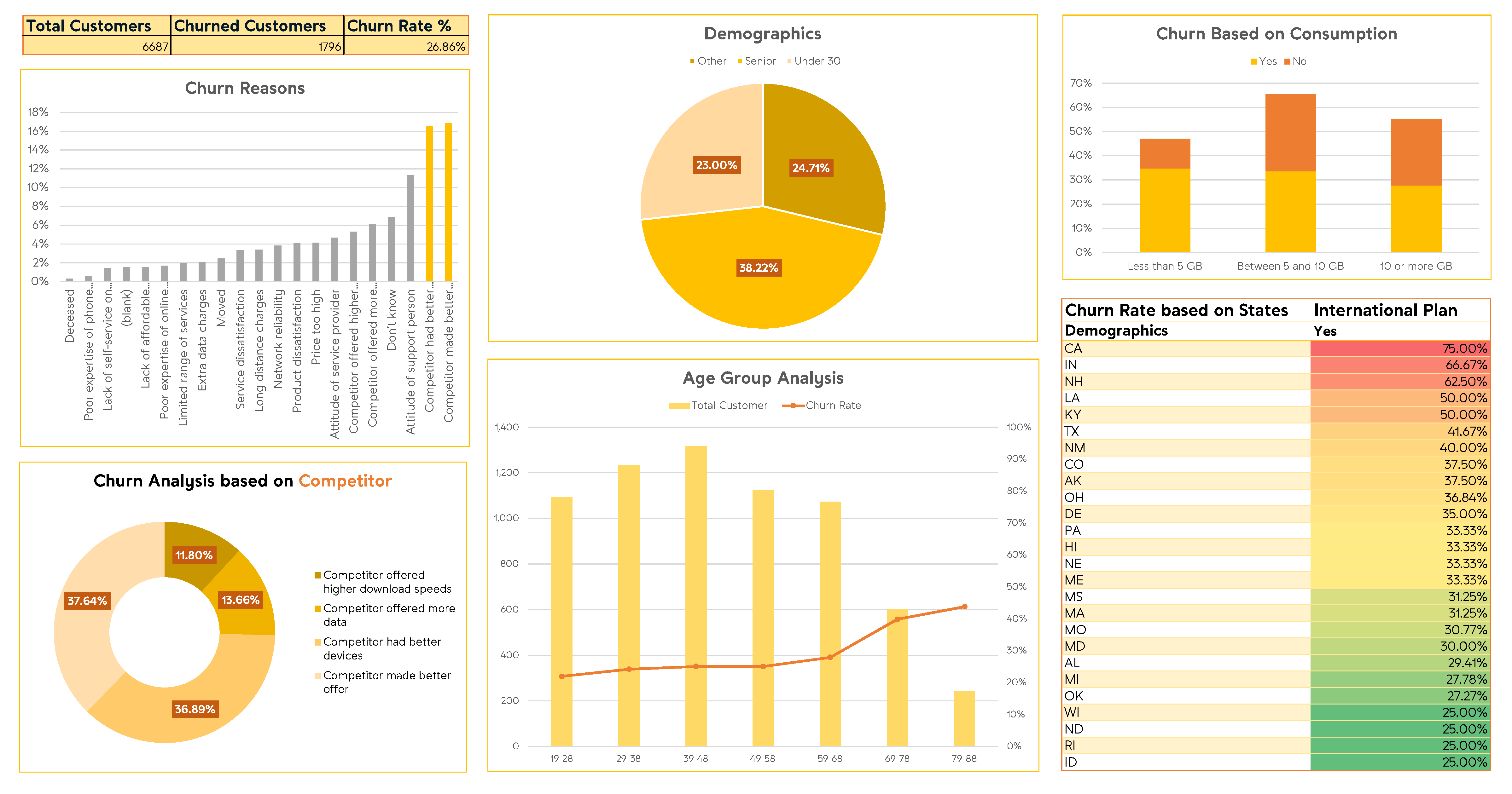
- —Computed an overall churn rate of 26.86% across 6,687 customers, with senior customers churning at a significantly higher rate of 38.2%.
- —Built PivotTables to break down churn by demographics (age band, senior status), contract type (month-to-month, one-year, two-year), data plan usage, and geography (state-level).
- —Identified month-to-month contracts as the highest-risk segment — churn rates exceeding 70–80% in early tenure months (1–24 months).
- —Found that customers on unlimited data plans but using under 5GB churned at 34.7% vs 12.3% for those without the plan, highlighting a pricing-value mismatch.
- —Assembled findings into a structured churn analysis dashboard consolidating key metrics and segment comparisons.
Project sourced from DataCamp. Dataset from a fictitious telecom company (Databel).